Brand guidelines
The Digitice brand.
How to use the Digitice logo, colours and typography in print and on screen. Download the files below; everything is free to use when you write or present about Digitice.
01
The logo
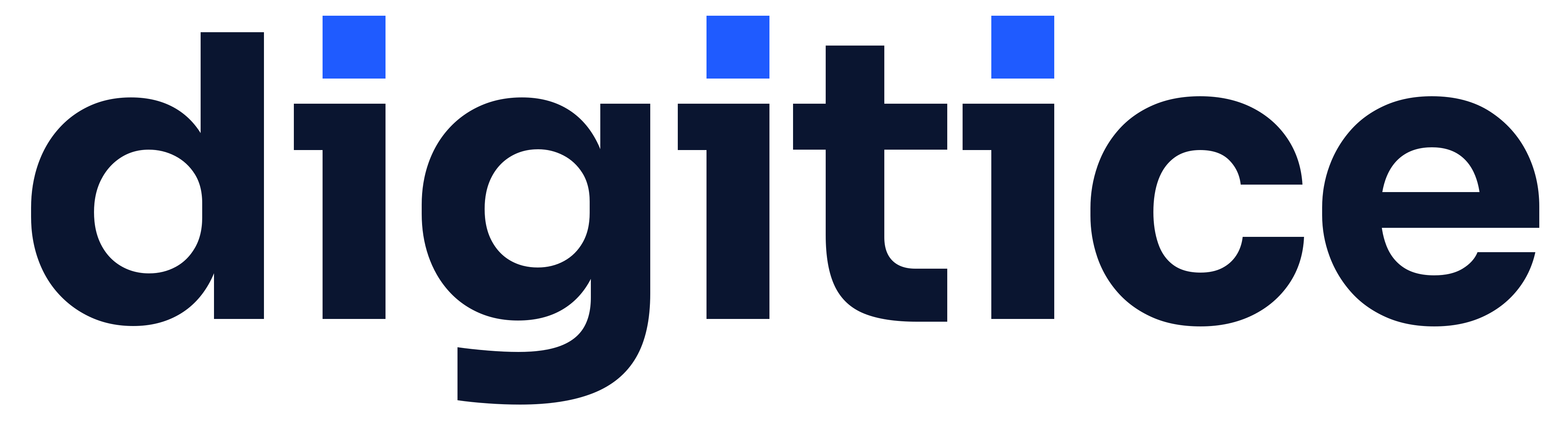
The wordmark is digitice in lowercase, set in Sora Bold with tight spacing and converted to outlines. Each i carries a square pixel in Electric Blue in place of its dot: the smallest unit of anything digital, and a reminder that we build things that work, one detail at a time.
The wordmark on its own is the primary logo. On dark backgrounds, including the dark mode of this site, use the reversed wordmark. Do not place the symbol next to the wordmark: they are two separate marks.
The symbol is the d with its pixel, on an Ink tile. Use it where the full wordmark would be too small: favicons, app icons, social avatars, embroidery and stamps.


02
Clear space and minimum size
- Clear space: keep a margin of one pixel-square's width (the blue square) on every side, doubled on print.
- Minimum size: wordmark 80 px / 20 mm wide; symbol 16 px / 6 mm.
- Embroidery and engraving: use the single-colour symbol at 25 mm or larger.
03
Colour
Ink carries the brand. Electric Blue is the accent: roughly one part blue to nine parts Ink and white. CMYK and Pantone values are nearest matches; always approve a printed proof.
- HEX
- #0A1530
- RGB
- 10 · 21 · 48
- CMYK
- 100 · 85 · 35 · 55
- Pantone
- 2768 C
Primary. Text, backgrounds, the logo on light.
- HEX
- #1F5BFF
- RGB
- 31 · 91 · 255
- CMYK
- 85 · 60 · 0 · 0
- Pantone
- 2728 C
Accent. The pixel, links, primary buttons. Use sparingly.
- HEX
- #1C2A52
- RGB
- 28 · 42 · 82
- CMYK
- 90 · 75 · 25 · 35
- Pantone
- 534 C
Secondary dark surfaces and hover states.
- HEX
- #EEF3FF
- RGB
- 238 · 243 · 255
- CMYK
- 6 · 3 · 0 · 0
- Pantone
- 656 C
Tints behind icons and highlights.
- HEX
- #F5F7FB
- RGB
- 245 · 247 · 251
- CMYK
- 3 · 1 · 0 · 1
- Pantone
- Cool Gray 1 C
Section backgrounds.
- HEX
- #FFFFFF
- RGB
- 255 · 255 · 255
- CMYK
- 0 · 0 · 0 · 0
- Pantone
- -
Page background and reversed logo.
04
Typography
Both families are free (SIL Open Font Licence) and available on Google Fonts.
Headlines · Inter Tight SemiBold
Human-led. AI-powered.
Tight tracking (−3% to −4%), sentence case, no full stops in navigation.
Body · Inter Regular & Medium
We design, build and scale bespoke web applications, MVPs and AI products for ambitious organisations. Senior people lead every engagement; AI accelerates every step.
Logo only · Sora Bold
Sora is reserved for the wordmark. Do not set headlines in it.
05
Tone of voice
Confident, not loud
State what we do and what it delivers. No exclamation marks, no superlatives.
Specific
Days, weeks, prices and outcomes beat adjectives. “Live in 45 days” not “lightning fast”.
Under-promise
Commit to what we can guarantee. Let the delivery do the over-delivering.
Human first
“We” and “you”. AI is how we work faster, never who you are talking to.
Write in UK English: organise, colour, programme (but “program” for software).
06
Please don't
07
In use
Naveen Nandharam
Founder & Director
godigitice@gmail.com




Next step
Tell us what you need to ship.
A 30-minute call with a senior lead. You leave with a clear scope, a realistic timeline and a fixed price, whether or not you work with us.